Back to Daily Feed 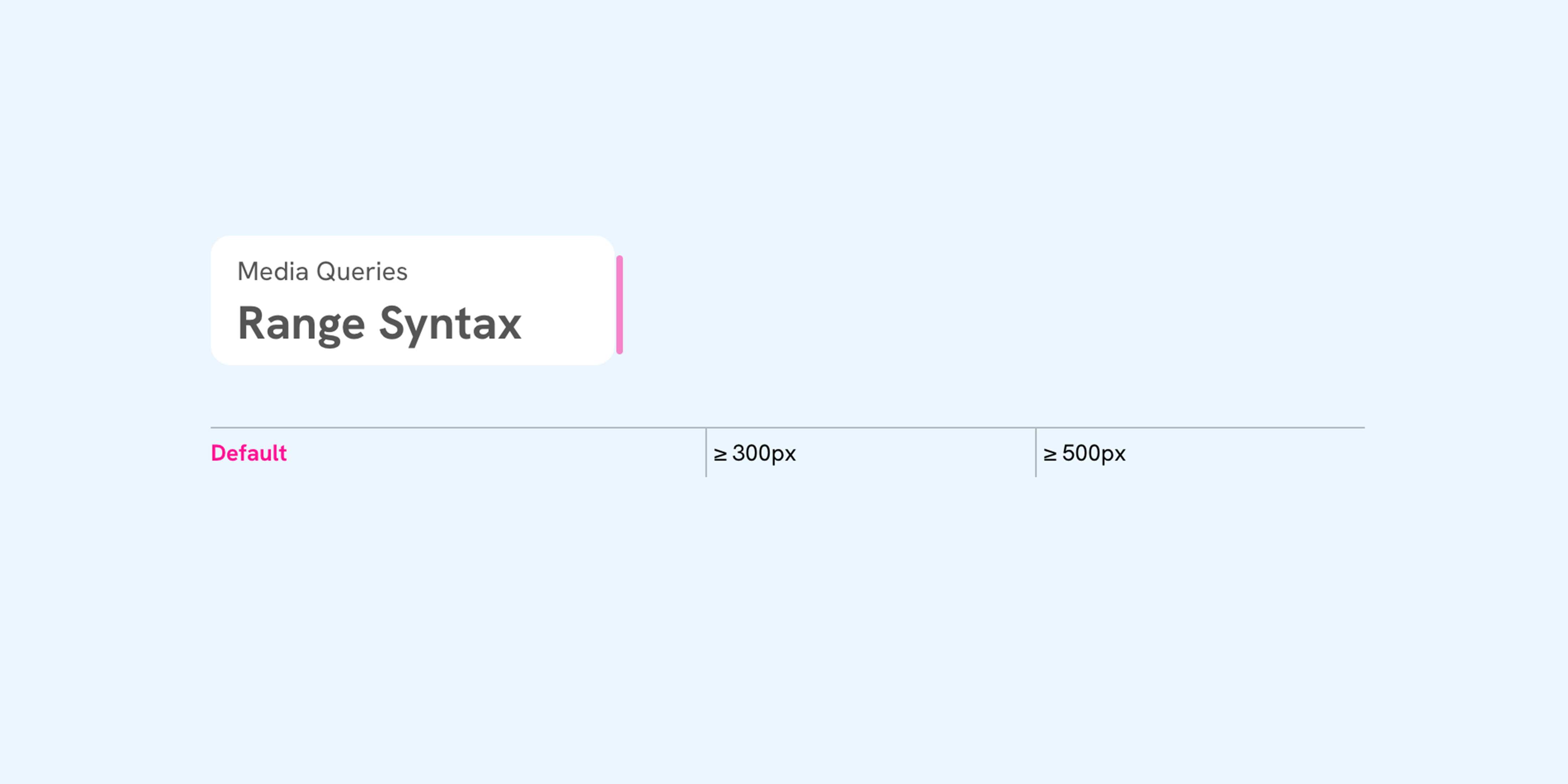
Mastering CSS Media Queries with Range Syntax
Worth Reading
Originally published on Ahmad Shadeed by Ahmad Shadeed
View Original Article
Share this article:
Summary & Key Takeaways
- The article introduces the modern range syntax for CSS media queries, offering a more concise and readable alternative to traditional
min-widthandmax-widthdeclarations. - It demonstrates how to use comparison operators like
<,<=,>, and>=directly within media queries to define breakpoints. - Examples illustrate single-condition queries (e.g.,
(width <= 600px)) and combined conditions (e.g.,(400px <= width <= 800px)). - The range syntax helps reduce redundancy and potential errors when defining responsive styles.
- It highlights browser support and encourages adoption for cleaner, more maintainable stylesheets.
Our Commentary
Ahmad Shadeed consistently delivers top-tier CSS content, and this piece on media query range syntax is no exception. We've been waiting for this syntax to become more widely adopted, and his clear explanations make a strong case for its immediate use. It's a small but significant quality-of-life improvement for CSS authors, making responsive design logic much more intuitive and less verbose. This is exactly the kind of practical, modern CSS knowledge we love to see.
Share this article: