Back to Daily Feed 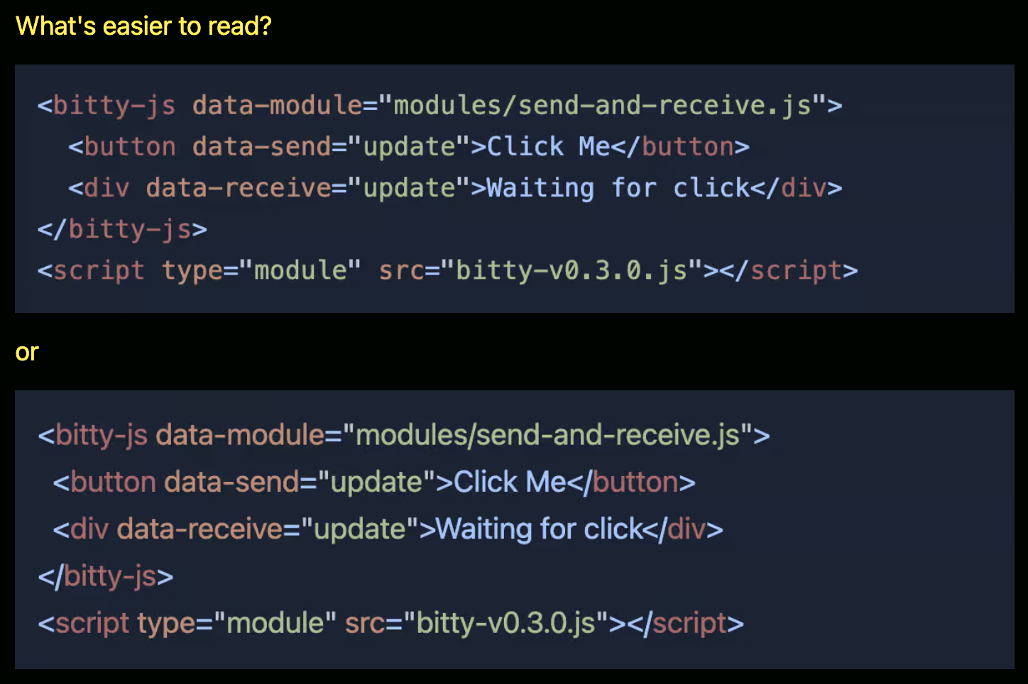
Exploring Proportional Fonts for Code Blocks
Originally published on Codepen Blog
View Original Article
Share this article:
Summary & Key Takeaways
- The article questions the universal assumption of monospaced fonts for code blocks.
- It explores the potential benefits and drawbacks of using proportional fonts for code readability.
- The author prompts consideration of whether "lots of code" is easier to read in non-monospace.
- The discussion touches on the handling of spaces and tabs in such a setup.
- It's presented as a thought experiment rather than a definitive recommendation.
Our Commentary
Okay, I'm going to be honest, the idea of proportional fonts for code blocks makes my brain itch. My muscle memory for alignment and scanning code is so deeply tied to monospace. But I appreciate the thought experiment! It's good to challenge conventions, even if I'm not ready to jump ship on this one. It's a fun, quirky read.
View Original Article
Share this article: