Back to Daily Feed 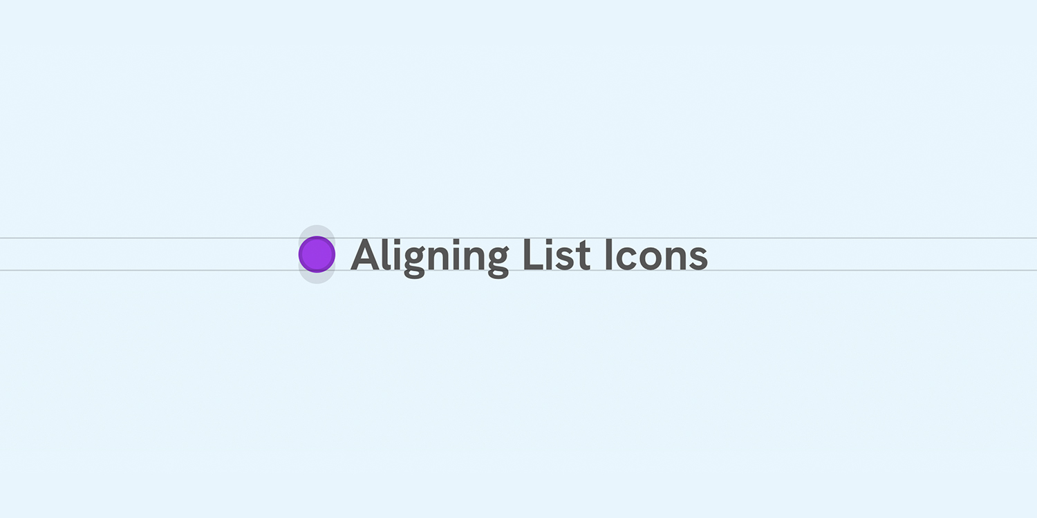
Mastering Icon and Label Alignment in CSS for Better UI/UX
Worth Reading
Originally published on Ahmad Shadeed by Ahmad Shadeed
View Original Article
Share this article:
Summary & Key Takeaways
- The article focuses on practical CSS methods for aligning icons and labels.
- It aims to improve the visual consistency and readability of user interfaces.
- Techniques discussed will likely cover various layout scenarios and common pitfalls.
- Achieving pixel-perfect alignment is crucial for a polished user experience.
- The tutorial will offer solutions to enhance both aesthetics and accessibility.
Our Commentary
Ahmad Shadeed is a legend when it comes to CSS deep dives. I'm always excited to see his new posts because they consistently deliver practical, actionable advice. Icon and label alignment might seem like a small detail, but it's one of those things that can make or break a UI's polish. We've all wrestled with this, trying to get things just right. I'm expecting some clever flexbox or grid tricks here that I'll immediately want to try out.
View Original Article
Share this article: